Gradient Border Effect
Background
Using a gradient border in web design can add depth, dimension, and visual interest to your elements. Instead of relying on flat, solid borders, gradient borders offer a dynamic and engaging look that can enhance the overall aesthetic appeal of your website or application.
There are several ways to create a gradient border using css. Here are few examples:
How to create a gradient border:
1. Border image and border-image-slice
.gradient-border {
  border-width: 5px;
  border-style: solid;
  border-image: linear-gradient(to right, #ff7a18, #af002d);
  border-image-slice: 1;
}
Changing the border-image-slice value allows you to customize the location of the gradient border. For example, specifying two values will set the top and bottom edges followed by the left and right edges, respectively. Providing four values sets the top, right, bottom, and left edges, respectively.
Example: Border-image on top and bottom only.
border-image-slice: 1 0; //(top: 1, right: 0, bottom: 1, left: 0;)
Example: Border-image on left only.
border-image-slice: 0 0 0 1;
The major con of this approach is border-radius and border-image-slice are not compatible. In other words, you can not add rounded edges to your gradient border.
2. Using a pseudo-element
Adding a pseudo-element (::before or ::after) with a linear-gradient background to create a gradient border effect.
<div class="gradient-box">
    <div class="content-box">
        Text
    </div>
</div>
.gradient-box{
    position: relative;
    padding: 5px;
    width: 100px;
}
.gradient-box::before {
    content: "";
    position: absolute;
    top: 0;
    bottom: 0;
    left: 0;
    padding: 5px;
    height:  100%;
    width: 100%;
    background-image: linear-gradient(to bottom, #ff7a18, #af002d);
}
.content-box{
    position: relative;
    background: white;
    color: black;
    padding: 10px 15px;
    width: 100%;
    text-align: center;
}
You can also add a border-radius, although getting it to look smooth may take some fiddling. For instance, I had to apply a border-radius of 10px to the pseudo-element and a border-radius of 5px to the content box to achieve a smooth corner.
.gradient-box::before {
   border-radius: 10px;
}
.content-box{
    border-radius: 5px;
}
3. Using box-sizing
This approach works by applying two background images and utilizing box-sizing to create a gradient-border effect. It is my preferred method due to its simplicity and compatibility with border-radius. To better understand how this technique works lets further explore the CSS properties of box-sizing and using multiple images as a background .
Background on box-sizing and CSS background-property
What is box-sizing?
The box-sizing property in CSS is used to control how the total width and height of an element are calculated, including its content, padding, and border. There are two main values for the box-sizing property:
1. Content-Box (Default):
box-sizing: content-box;
In the default content-box model, the width and height of an element are calculated only based on the content's dimensions. Padding and border are added to the specified width and height, increasing the overall size of the element.
2. Border-Box:
box-sizing: border-box;
In the border-box model, the width and height of an element include the content, padding, and border within the specified width and height values. Padding and border are considered part of the box's dimensions, and they do not increase the overall size of the element beyond the specified width and height.
3. Padding-Box:
box-sizing: padding-box;
The padding-box model includes the the content and padding, but not the border when determining the width and height.
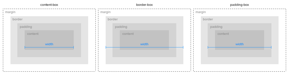
Image sourced from A Beautiful Site
Multiple background images
Css allows you to add multiple background images with the background property.
Images are separated with a comma, and stacked on top of one another, with the first image laying on top.
.element{
   background: url('top-image'), url('bottom-image');
}
Creating the gradient-border with box-sizing
We're going to start by creating an element with a border that's transparent. After that, we'll set a background for the element, overlaying a padding-box image on top of a content-box image. The content-box image will appear larger since it doesn't include the border in its width and height calculations. This setup allows the transparent border to show through behind the top image, which is within the padding box.
An important note: To achieve a hollow appearance for the button, you must ensure that the padding-box image matches your background-color. Therefore, if you use the same border-gradient on pages with different backgrounds, you'll need to adjust your padding-box image accordingly to maintain the desired hollow effect.
<div class="gradient-box"> Content </div>
.gradient-box{
   background:
   linear-gradient(#fff, #fff) padding-box,
   linear-gradient(#3acadf, #729efd) content-box;
   border: 5px solid transparent;
   padding: 10px 15px;
   width: fit-content;
   border-radius: 10px;
}
Conclusion
In conclusion, creating a gradient border can significantly enhance the visual appeal of your web elements, adding depth and dimension to your design. While we explored a couple of methods in this guide, such as using border-image and pseudo-elements, it's important to note that there are several other techniques available, each with its own pros and cons.
If you'd like to explore more about creating gradient borders with different approaches and their respective advantages and disadvantages, check out these resources:
How to do gradient borders in css
How to add a pseudo-element gradient effect
Experimenting with these techniques can help you find the best approach that suits your design requirements and maintains consistency across various backgrounds and elements in your web projects.